Hannah Beachler has carved out a distinguished career for herself, first as a set decorator and for the past few years as a production designer. Already a collaborator with BLACK PANTHER director Ryan Coogler on his earlier films – “Fruitvale Station” and “Creed” – in addition to her work with Coogler, she is known for her ability to bring texture and life to intimate stories like those of “Miles Ahead”, “Hateship Loveship” and “Moonlight”. Now, she reteams with Coogler on her biggest and most challenging project to date, BLACK PANTHER.
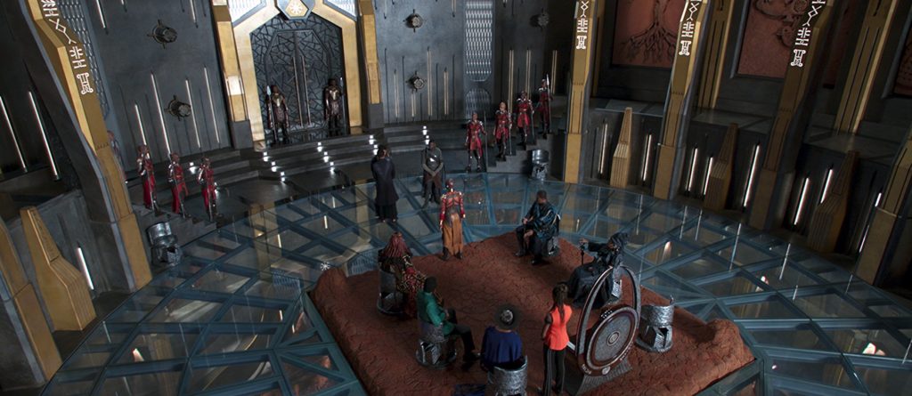
One look at Beachler’s work in BLACK PANTHER and you can already hear Oscar 2019 calling her name. Her production design is off-the-charts incredible. Critical to the film as a whole is that if we don’t believe in the world of BLACK PANTHER’s Wakanda, which is idyllic in its blend of new and old worlds, then the film doesn’t work on any level. Thanks to Beachler, from the high tech of Shuri’s lab and technology to the delicacy and sentimentality of Nakia’s room where Agent Ross is recovering to a small apartment in 1992 Oakland to a casino in Korea, the world is visceral and real, creating an almost tactile – and eye-popping – viewing experience. The meld of traditional African culture, history, and geography creates a rich, lush palette from which Beachler works. Warrior Falls is beauteous as are the underground Wakandan caves with the VFX lit vibranium. The Throne Room is as a regal as regal can be but with a clean-lined simplicity of natural stone and ore elements melding the past with the technologically advanced present, while the Korean casino design just begs for the audience to reach through the screen and place their bets. Striking is that Beachler’s prior works, and particularly those with Coogler, have all been on a much smaller, very intimate scale as opposed to a Marvel tentpole film. But take a close look at BLACK PANTHER and you see where Beachler goes beyond the initial beauty of the production design itself and retains that intimacy in her designs. There is nothing grandiose or opulent. Her set pieces are designed and crafted with curved embracing walls, lower ceilings, corner nooks, small apartments, thus adding a visual voice focusing on the personal stories being told. But then when viewing each individual set and story together, there is a seamless synergy with the puzzle pieces coming together and creating the bigger picture and scope of the film as a whole.
Sitting down with Hannah Beachler for this exclusive interview, the first thing one notices is her effervescence and excitement about BLACK PANTHER. The more she speaks, the more her eyes light up, while her smile gets even bigger, and her excitement intensifies as she becomes joyously animated in discussing this dynamic work. . .
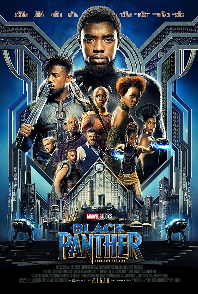
I’ve been an admirer of your work for a while, Hannah, and what you do with Ryan, but to see what you have done here, I’m calling Oscar nomination for next year for you. This is amazing.
Thank you so much. I really appreciate that.
You have such outstanding set pieces. The waterfall is amazing. The cave is breathtaking. The Korean casino. I want to go there. I want to be in there. I want to gamble in there. I want them to take all my money. It’s that beautiful. You want to be in that room.
That’s fantastic! One of my favorites.
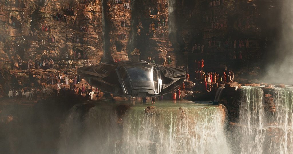
And the cave! This is a very eclectic palette, yet it’s also very cohesive. How did you approach this? It’s a lot different than doing South Philly in “Creed”!
It sure is! That was one of the really big things, was try to have it be eclectic, but have the movie be cohesive from beginning to end, even when we’re in other countries. Ryan and I really worked on that. We came up with things, small things, that would kind of bring that cohesiveness together. Color was one of them. Ryan, actually Ryan was very specific about this, is this color. Michael’s colors are blue. The river tribe was green, the royal color is purple and black. We tried to really work that in.
The other part of that is kind of really being delicate and thoughtful and meaningful about how we modernize certain traditional African cultures and tribes. Really trying to not just take something that seems cool and then make it something modern, but take something and what it actually means, and then use that in the same way that modernizes it. We’re not really just appropriating it and putting it someplace. We’re taking that specific thing for that specific reason, and saying, “This is something that we can modernize and turn it into tech,” or, “This is something that we want to do,” like the rondavel tops on all the skyscrapers when you’re coming into Gold City. I mean even me, I was like [WOW] because I hadn’t seen any of it on the big screen yet.
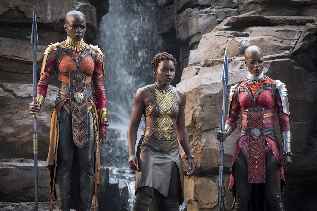
You saw it last night for the first time?
Yeah, I did. It was just along with everybody else. Those were small things that we tried to do and not call it out in a way that it’s like, “Hey, look what we’re doing with that.” Really the visit to South Africa, for things like the waterfall, I don’t know how many pictures of rocks that I took. If somebody was to look through my photos, they’d be like, “There’s like a 100 pictures of different rocks. I don’t understand.” It was really about what, and the part of South Africa that we were, what’s really the indigenous look of the rocks, the color. The thing that I noticed when I was in South Africa, everything was so contrasted, from size to color. You would look at these beautiful vistas, and you’d see the red, because of the red mud, you’d see the red rock. Then there would just be black through it in this way that you’ve never seen it in nature before. We really tried to bring that too.
You really embraced the contrast of the culture, of the herding, the shepherding, all of it. I’m curious how closely you worked with Rachel [Morrison] with the cinematography because the lighting is so specific. Especially when you talk about the rocks and the shading and the texture, your production design comes across as being very tactile. There’s a very tactile sense you can feel. It’s like you can touch it as you’re watching this. I’m curious how you worked with Rachel and her lighting design to really bring these things forward. You could have designed the rocks flat, and plus you’re working with styrofoam to do, and that takes on a whole different texture with paint and color. I’m curious about that dynamic, to make this look as beautiful as it did.
We talked about it every single day, from the time we took our trip to Africa. Rachel joined and everybody joined the last week that we were there, before we left. We started the conversation right then. Ryan had always said, “I want to get this African sunlight. I want to get this.” Because it’s very specific. It’s very different. “I want to get these African skies. I want to get these African night stars,” and things like that. We kind of focused in the same way when we were in South Korea. That’s where it started with Rachel.
Once I started concepting and getting the illustrations, we’d sit down and look at things, and be like, “This is what’s really important about this set. This is sort of my meaning that I’m bringing behind it,” and then she would put her meaning on top of that. I tell you what, because people ask me a lot, “How’s the transition from small films to Panther?” This is where my small film experience comes in, as well as with Rachel, because she uses a lot of natural light. In the indie movies, you make it creative, but it’s not a choice sometimes because of the budget. Here, the fantastic thing is, is that I think what we did and what Rachel did is that you can show that those things are purposeful. Those things can be purposeful on a grand level. You don’t have to bring in everything. That’s what creates the intimacy because that’s where we come from, is these intimate sentiments. It’s who Ryan is, and that’s the story that he’s telling. The biggest challenge was going in, because I love Marvel films, so I’m all about it, for me, it’s like there’s always these big, grandiose spaces, and I knew that Ryan was going to tell this intimate story about father and son, and family and country. It was always, “How do I create these bigger spaces and feel intimate?” It’s the lighting and the textures. The way that Rachel uses natural lighting, and you look in the sets, and there’s always some kind of natural wood, clay, stone, something.
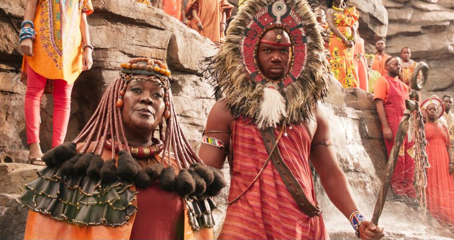
Then it’s carried through in the costuming and the jewelry as well.
Exactly.
A perfect example are the waterfalls. While it’s grand in scope, the way you’ve crafted it, so it more or less curves and mirrors and surrounds the pond, very intimate setting.
Exactly.
The caves, you’ve got the low hanging ceiling with the ambient purple light from the vibranium coming up from below. Then you counter it with their golds behind it. Same thing in the casino. It’s always very intimate, an intimate corner. Rachel only picked one or two center shots of the tables, everything else are in small intimacies. The throne room is intimate, the Oakland apartment. It’s all small, but put it all together and it’s on such a grand scale.
Exactly. It’s huge. I’m glad that you noticed that because that was something that was so important to me. I talked to Marvel about it. Ryan and I talked about it. That exact thing was so important, was to bring that intimacy to it. I’m so happy that you recognized that because that’s who I am as a designer. I think that’s my biggest aesthetic. I do have the colors that I use all the time. People probably notice that. I think what I do is I make it intimate. It’s just really important to me because that’s the space for which you feel. That’s the space for which we love to live and feel. That’s who Ryan is. This is, overall, his story, his vision, and I always tell Ryan, I’m always like, “This is about you. This is you. You are that man. You are having that struggle.” It’s like knowing him and what he means to me, I need to bring that. I bring it with every one of the movies I work with him on because it’s that important.
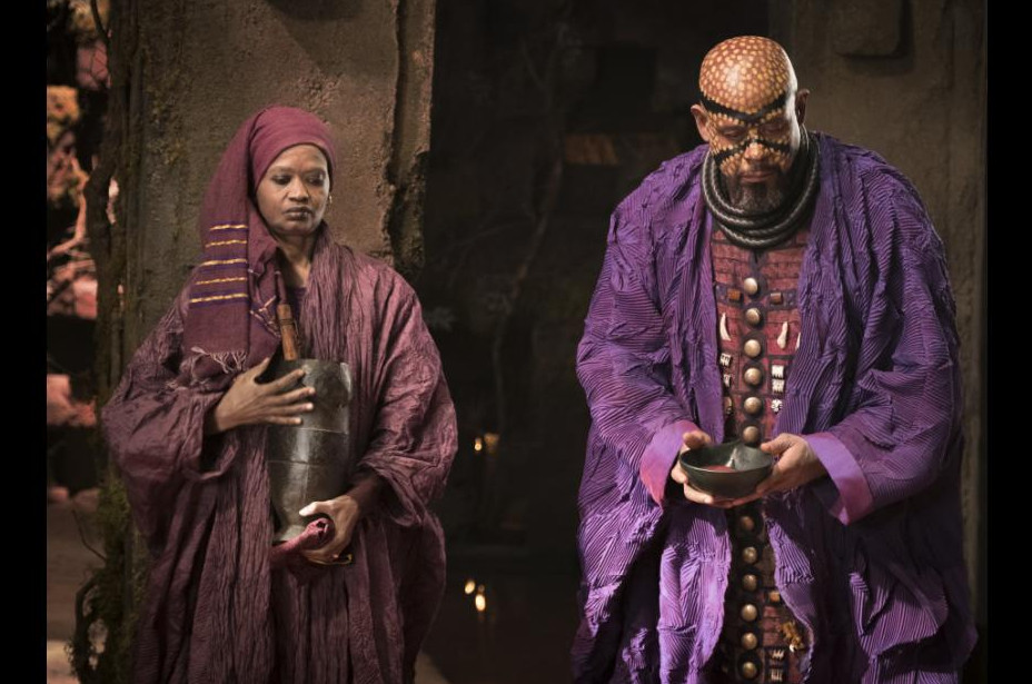
I’m curious, because you mentioned color, and color is so important here because of the grand scale of the story, this is where I was so disappointed, because we see the color of these specific tribes and their costume, and their innate setting, but we don’t get to learn about them. It’s like, “Okay, I want Black Panther 2, I want Black Panther 3, and I want to learn more about these tribes.”
I know. Wakanda is vast and it’s big. We really did research and develop all of the tribes. There is this wonderful stories behind why the merchant tribe lives in the part of Wakanda that they live in. The merchant tribe and the artisan tribe, and they lived in this new province.
Fine! Tease me. Tease me, Hannah! The colors are so specific. I mean, we have the one tribe in the Frank Gorshin “Batman” Riddler green outfits!
Yeah, it’s fabulous.
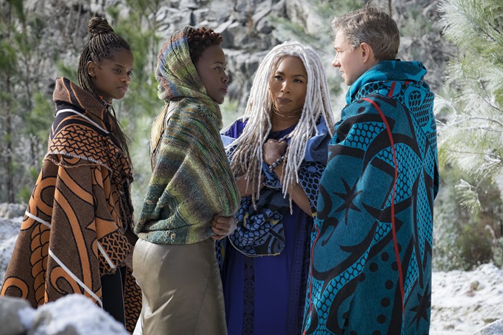
How did you go about selecting color? Was Ryan involved? Was Kevin Feige involved, from Marvel? How did this color palette come to life because this really expands what we’ve seen from you in a color palette.
Yeah, absolutely. I tell you what, when I went to Africa, and it’s big, so we were driving a lot. I’d be watching people all the time. Everyone’s colorful. The women were fabulous. They wore these skirts that come down past their knees, but they wore socks that come all the way up. The socks were always like striped, or pink, or purple. They’d have these scarves on, that were these beautiful colors. That was such an important part of the culture. It’s such an important part, the textiles and all this color. All the different architecture, the Grundsy architecture, the Dogon architecture, all of these different tribes. The Oma Valley tribes, with all the painted faces. They find these things in nature and then they create these beautiful flowers and all this. So, I knew. Ryan and I was like, “This is going to be colorful.”
I think the most colorful thing you’d done before this was “Miles Ahead” for Don Cheadle.
It was. There was a very specific color story that went through Miles Ahead. We tried to do that [here] as well. Then Ryan’s colors though, Michael is blue, which he is in every Ryan movie, if you look back. Royal is purple and black, so we had those as our base. I really just wanted people to feel the sense of joy through color.

So, I have to ask you, Hannah, what is the magic of your collaborations with Ryan that keep you coming back for more with him?
I think sometimes people are lucky to find other creatives they are aesthetically compatible within the medium of film. Ryan and I found a creative language that was very similar but we’ve had different experiences in life so we remain individuals. It’s also that we have a shorthand and we’re friends outside of work. Ryan is a true storyteller and visionary and I am blessed to be able to be a part of the stories he tells.
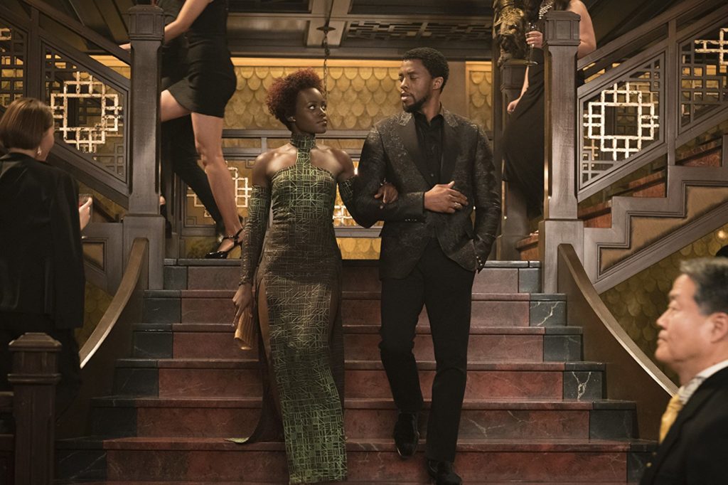
Given that over the past several years, you’ve done small, intimate, personal films like “Fruitvale”, “Moonlight”, “Creed”, and “Miles Ahead”, and now you’ve done a huge Marvel tentpole which while intimate in its characterizations and story, has all the production bells and whistles Marvel is known for, what are the pros and cons of each for you as a designer and have you now developed a preference for the type of film you like to design for? If so, which and why.
I look for stories. Great stories make great films, and for me it’s not about the budget they come in, but the experience I want to give myself over to for however long. I have to be a believer in order to create any type of canvas/world. Each project offers me knowledge and understanding and that’s how they are different to me, and the challenge is always making the audience believers right along side of me on whatever story I’m part of telling. I don’t have a preference for either one really, it’s nice to be able to design on different size budgets to keep me sharp and on my toes too as far as being resourceful, finding creative solutions to problems that arise, being able to make something small feel big when necessary, and something big feel intimate.

Now that BLACK PANTHER is about to be unleashed to the world, and as you look back on the journey of bringing this vision to life, what do you personally take away from the experience of making this film which you will now take forward with you into future projects?
I learned so much from this journey. The biggest takeaway for me was you have to stand by what your designs [are], but you also cannot be so attached that they don’t evolve. I learned that a great team of people, the entire art department, who are as invested in a story as you. are unstoppable in what they can accomplish no matter how tired, no matter what pops up that may move you in a new direction. And I learned that my best is good enough; I don’t beat myself up quite as much as I use to in the pursuit of perfection. I’ve learned to pursue truth and the rest will come.
by debbie elias, interview 01/30/2018


