THE GET DOWN is Baz Luhrmann’s first foray into the small screen world. A Netflix original two chapter series with multiple episodes within each chapter, THE GET DOWN explores the genesis of hip-hop; the “death” of disco and the emergence of an explosive and creative art form in the Bronx that went on to take the music world by storm as told through the eyes of “The Get Down Brothers” and their friends. One of the most exciting shows to be found on air today, be it cable, network television, or streaming services, THE GET DOWN is a perfect combination of costume, production design, cinematography, and music, immersing us in one of the most significant periods of music history, a world that some lived, some only dream of, and some now experience for the first time.
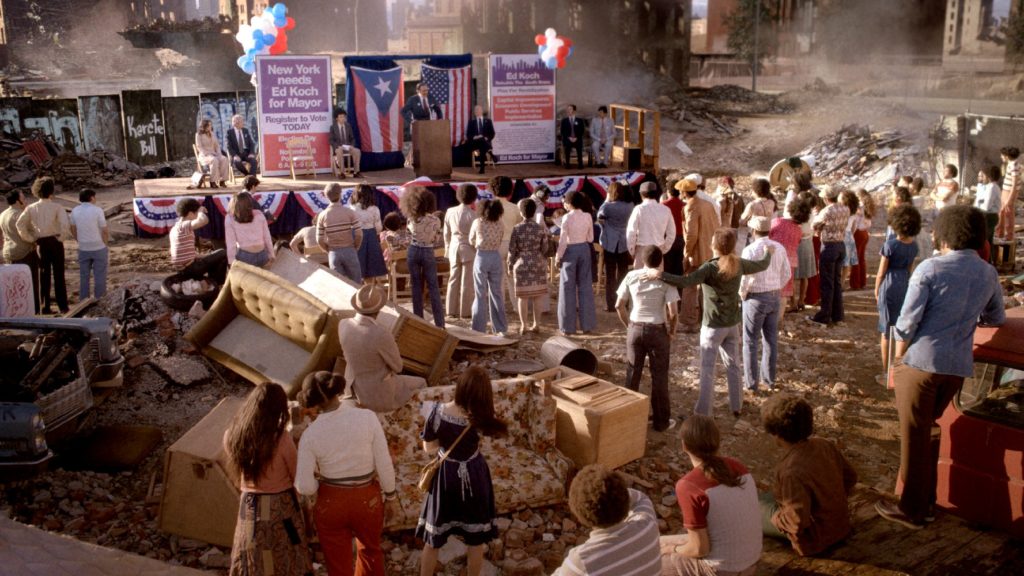
Focusing on the transitory years of the disco-ending 70’s and the emergence of Brooklyn-based punk and hip-hop, from the iconic Bronx tenements to the SoHo art scene, from CBGB to Studio 54, and even the monied business world of Manhattan, THE GET DOWN is the story of a group of kids in a decaying and dying world who give birth to the future of music, and the future of the Bronx.
I had a chance to speak with production designer KAREN MURPHY and talk about the era and her process in designing the distinct and distinctly different aspects of that ‘77-‘79 period, from the gaudy to the graffiti, from posh to poor, from vintage 1970’s kitchens to building floor plan replicas of tenement buildings in the Bronx, and everything in-between, with the vision of Baz Luhrmann leading the charge.

Thank you for taking the time to speak with me today about THE GET DOWN. I know you’re busy with “A Star Is Born” which I can’t wait to see. I loved what you did with “The Light Between the Oceans.” I am blown away by what you have done with THE GET DOWN.
That’s great. That’s great. I’m glad to hear it.
The diversity and the eclectic, yet cohesive, nature of what you have designed, from a production standpoint, a set standpoint, is so period perfect, so character perfect, and contributes so much to the level of storytelling. Absolutely outstanding work, Karen. The production design is its own layer of storytelling in this series.
Yeah, it’s very layered. You know Baz’s [Luhrmann] work, obviously. He is incredible for inspiring this kind of work.

Because there is such a wealth of visual reference materials for 1977, ’78, ’79, how do you go about developing a visual framework within which to then break it out into specifics like The Inferno, like The Palace as being a church, for Ruby Con, for the homes, which are also striking and really show the social strata of these people?
Obviously there’s a huge wealth of photography out there for that period, so we had to be really New York specific and particularly Bronx specific, South Bronx. It’s harder to find that photography from that particular area in that period. There were a group of photographers called “Seis Del Sur” who were the photographers from down south. All of their work was very much street photography and some paralleling with the music industry, just the underground music scene in the Bronx and South Bronx at the time.
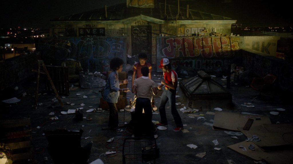
What they were doing was documenting what an area of the city that no one really cared about at the time [looked like]. They were documenting people of that place, and that place. So I took a lot of inspiration from their photographs. Incredible photographs of burnt out cars in Robins Field, the buildings. There’s a beautiful graffiti piece called “Broken Promises” that was on one of these burnt out buildings. We would constantly be pouring over these photographs finding details from them. Just how the record players and the turntables and the records [looked], and how they used to plug in all their own gear because some of it they used to find, some of it they’d take from their parents, some of it they would steal and then they’d cobble together this whole kind of DJ setup, which was very specific to this one person. So we had to find all those details in photographs.
How challenging was that?
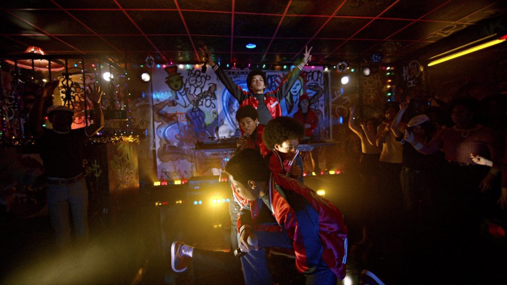
It was harder than you think. Just trying to work out what a club, a disco club, the fading years of disco, what that disco club would look like in the Bronx. It couldn’t have been like Studio 54 because that was hip and cool and all the actors were going there. It had to be something that felt a little more disenfranchised and like the area is irredeemable. Some of it was in bad taste, but in a good way.
As is with all of Baz’s things visually, you don’t just do things subtly. You’ve got to really bring that home. So I just looked at a lot of clubs, like Disco Fever and places like that that were clubs at the time in the Bronx. There’s very few photographs of them. We’d try and go visit the sites of them, get some gleam, some sort of piece of information. Then I’d find pictures of clubs in other American cities that were in areas that were similar, areas that had fallen away from mayoral care in a way, like areas where people were disenfranchised.
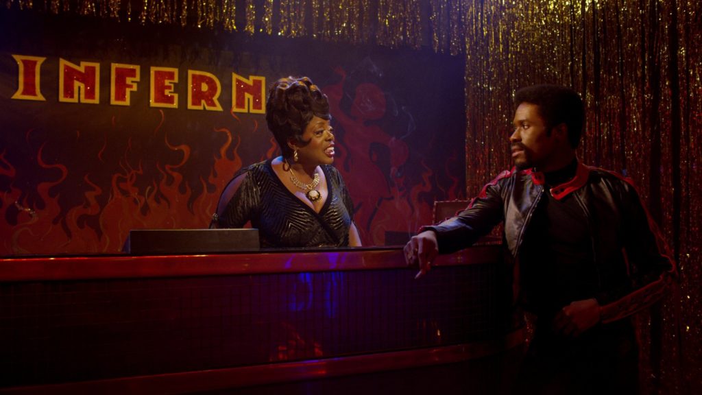
So, like in Chicago and Detroit, that whole visual kind of track is a photograph of the club, and it is a real kind of mix of all of those influences. And the fact that it’s called The Inferno, and the red and the lights and the disco, all of that would’ve fed into that.
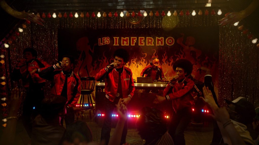
You know how to use color. Baz is known for his love of color in everything he does. And you worked on “Moulin Rouge!”, perhaps the most colorful film he’s ever done. How did you go about developing the specific color palettes for the various sets that you designed and created? Obviously, Inferno, yes, it’s got to be red. It’s got to have the neon lights going on.
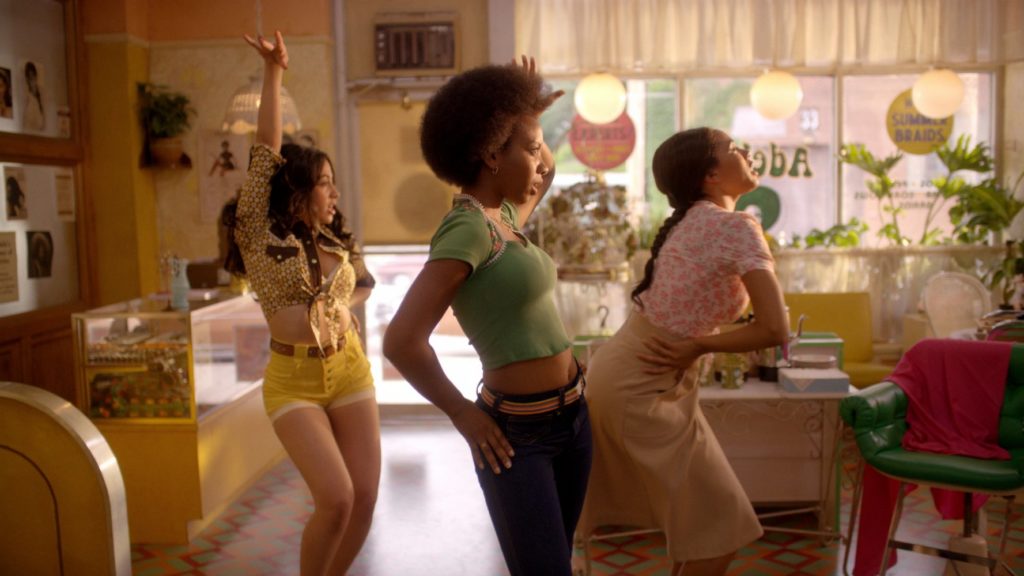
But it’s also got to have a gaudiness to it. That’s what I was saying about the difference between it and Studio 54. Any of the cool downtown discos was that was sort of like the Zeitgeist of fashion. This was pulled back from that a little bit and this was the people trying to express themselves in a sort of lavish environment with limited means. So, with the palette we were trying to create, particularly with the main apartments like where the boys were, the family was living in this apartment, and they essentially are the glue that held that group of people together. They were a strong family unit. So we wanted to really create a warm, happy environment in that house. So we gave a little bit of a history to that family. We thought that they had moved in there, into that apartment when the children were babies. So they had gone through having a much smaller apartment. They’re like, ‘Well we’ve got three kids now, we’ve got to move into something bigger.’ Or four kids actually. They’re in something bigger, so we gave them sort of a history, and a warmth. Part of that was based around where we thought their father was from. We knew he was from the Caribbean. So there were a lot of influences there, from cultural influences, as well as just trying to bring some warmth into the show.

And then for Books, for his apartment, that was the opposite of that. His mother was not around, he was staying with his aunt. She had a boyfriend who wasn’t very nice to him. They were living in a project, so their apartment was low ceilings and stripped back of color, like all the color was removed from it. And I literally walked into some of these places and it’s true to a certain extent that you actually feel a little bit like that. And the buildings were the same from the 50’s and 60’s, so we were doing the same building but at the time it was a new-ish building. So I actually used a floor plan of one of those real apartments and the size is exactly that. We built the set and stripped the color out of it so the real color came in with the character.
He’d be wearing something colorful, he’d walk into that room and he’d bring it in. Kind of like, it said something about the story, it said something about the character too, that he brought story and he brought meaning, and he brought poetry with him wherever he was. So those kinds of things were really important in the design of the show.
How closely did you work with Jeriana [San Juan] with the costuming, because of the very nature of the production design and the costuming helping to define each of these characters and because of the importance of the color and the contrast?
In some of the costumes we’d look at them in parallel, look at them in the set. We talked to each other about palette reports and then also mixed up a photoshop for the character in their costume into the set, into the environment, into the world. We’re out on the street, and there’s a lot of graffiti and we sort of photoshopped them into that. There was a real parallel with the work, so it wasn’t like one was jarring the other. For example, where they had THE GET DOWN, where they had the party, the first big party in between the buildings, we’d sort of stripped that back of color, because it was an exterior, sort of broken down environment. But the color came in with the graffiti, and it was the same with the clothes, there was really strong colors coming through. So it was very synchronized.
With the sets that you designed, particularly Inferno as that’s probably the best example, how difficult was it to actually find pieces to put in there, period perfect pieces of this disenfranchised, ‘We’re going to create our own, a Mickey and Judy, we’re going to create our own club here.’? Were there still furnishings and pieces like that around that you could find that hadn’t been destroyed?
For sure. I mean there are certain things like in the club VIP areas and things in those sets we found couches and sofas and chairs. We’d often recover them. Our set decorator went to estate sales and she found a kitchen in houses that were completely removed from the 70’s, and we would use an original kitchen. For example, the one we used in Books’ apartment is an original kitchen from that time. So, there’s of course a lot of shopping that goes on and looking around, and if sometimes it doesn’t quite work we either change the fabric or we paint it, or we make it, we build it from drawings; something that’s really appropriate and accurate, which is often what you’d do. I think because over the years the 70’s has become quite fashionable there’s still a lot of that kind of stuff around.
And now the mid-century thing has sort of taken over the 70’s as being a cool thing to have. In the 90’s people still had a lot of 70’s furniture. Now 70’s furniture is becoming a bit unfashionable and there’s more of it on the market, and it’s cheaper. So if we were doing something set in the 40’s, 50’s, 60’s, it would be harder because the mid-century stuff is at a premium right now. It’s quite the fashion. So I think we were lucky in that way. We were able to add some pretty gaudy, pretty out there stuff, but also some really beautiful things. When we were doing downtown environments and the office, for example, I was thinking of the higher design at the time, and we were thinking of fashion designers like Halston, and the art galleries on the upper east side, and the party scene that was going on, the vogue-ing in Manhattan.
We had a few worlds. We had our Bronx world, but then we had our more high-brow downtown world which we also had to track in at the same time. So there are lot of super graphics, and sunken bedrooms and big double beds and beautiful, expensive looking furnishings and hotel rooms. So we had to sort of walk in both of those worlds. But those people still exist, we were able to find them around the place.

How exciting is it for you as a production designer, coming off a film like “Light Between the Oceans”, which is all one period and essentially the same socioeconomic group of people that you’re looking at with limited resources. But here you’ve got the world of disco, the world of hip-hop, colliding that allow you to pull from both worlds. Does that excite you and present challenges for you that you like to handle?
Oh for sure. I think one of the greatest things about our jobs as filmmakers is that we get to learn something new every time we try to tell a story. “Light Between Oceans” was set in sort of post-World War I, people were very frugal and were very tight, and there wasn’t much opulence at the time. So I was able to get into that mindset and actually do my research and work out what life actually was like, what daily lives were like. And because I knew that, it had become easy. And the same thing here. We researched all those photographers, the graffiti world, the cartoons and kung fu world at this time. That sort of comics really influenced a lot of people in hip hop. Just because we gathered all this information and research, every time I was presented with another group that said that we need a club where the boys turn it into theirs, where they form their own club. We were like, what were those like? So they were often just places they’d squat in, and it was a building that there wasn’t anything very interesting about it, they’d just get in there and graffiti it and paint it and put day glow paint up and put linoleum underfoot. I actually didn’t see pictures of it, but I’d read about it. So you take that information and you put into practice in reality, and it sort of comes from that. It always comes from the research, and it comes from the story. The story requires layers, certain layers of meaning. Then you can apply that into an artwork on the wall, or something peripheral or the graffiti, the design for the graffiti can have some hidden meaning in it. That’s how, in Baz’s world, you get such density and richness. Is by everybody understanding that world very clearly and being able to layer the meaning onto each element in that world.
Before I let you go Karen, I just want to ask you about working with Baz. How exciting is it because I know Baz will push the envelope even further than the envelope exists? How exciting is that for you, having somebody like Baz as your producer and collaborator, who pushes the envelope beyond the envelope as opposed to so often there many filmmakers that want everything to be restrained, they want their hand on the button and don’t give you the freedom, you’re more inhibited or restrained in what you’re allowed to do?
Yeah, no, absolutely it’s very exciting, and I’m inspired by Baz. Any discussion I have with on a creative level I’m always inspired by. I walk away from it learning something or understanding so much more about what he’s trying to say with the piece. So if you listen to him, if you’re part of his collaborative team and you listen to him, he is very smart, very well informed person, particularly with this world, he’s really researched it.
He’s living in New York, he’s socializing with those people, the people in the Bronx, he understood the political structure of the place at the time and now. There are so many local community members. He is so well informed and I just feel like, any conversation I have with him about it is inspiring for me to create something. I feel like almost useless to the extent of what needs to happen because you’ve heard it come from him. I would never be guessing, what should the structure of this be, what should that be, because I just thought that he sketches a world out so clearly, that there’s no way that we as his collaborators can get it wrong. And that’s why I think that you as the viewer are seeing something that’s very truly Baz Luhrmann.
#
by debbie elias, interview 04/27/2017


