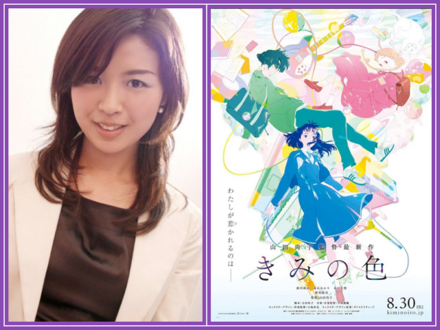
I had the privilege to sit down for an in-person exclusive interview with acclaimed director NAOKO YAMADA at the Animation Is Film festival in Los Angeles in October to discuss her new anime film, THE COLORS WITHIN. Conducted through an interpreter (whose joyful personality perfectly matched that of Naoko), the language difference proved inconsequential when it came to Naoko conveying her emotions and passion for this film. I could see the joy on her face and in her movements as she talked about the film, something that comes through in the film itself. The interview has been edited for syntax associated with the verbal translation.
SYNOPSIS: Totsuko is a high school student with the ability to see the ‘colors’ of others. Colors of bliss, excitement, and serenity, plus a color she treasures as her favorite. Kimi, a classmate at her school, gives off the most beautiful color of all. Although she doesn’t play an instrument, Totsuko forms a band with Kimi and Rui, a quiet music enthusiast they meet at a used bookstore in a far corner of town. As they practice at an old church on a remote island, music brings them together, forming friendships and stirring affections. Will they discover their true ‘colors’?
This is such a beautiful movie. I fell in love with it at the opening because you’re giving us different kinds of animation from the start. We have crayon/pastel, pen and ink, watercolor, and it’s done so beautifully with a watercolor wash that the colors kind of lightly run into each other immediately. The film is just beautiful and you want to watch and keep watching and it just gets better as the film goes on.
Thank you.
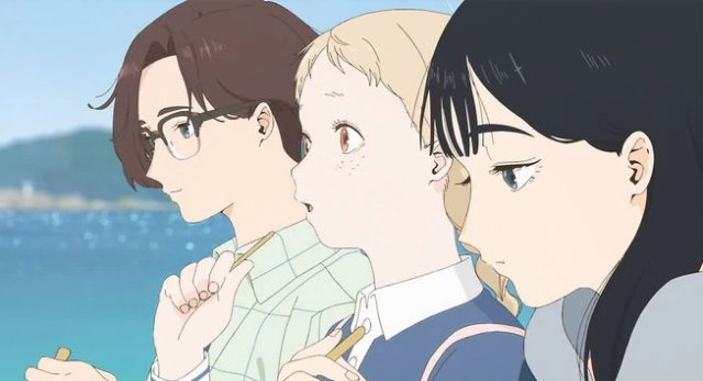
I love how you use color here to define Totsuko’s emotions, what she sees, and how she sees everyone and everything. And the fact that you keep that bright, bright blue just for Kimi is so striking, but it tells us exactly how important Kimi is in this story, in this friendship, in this dynamic. And it makes it very easy to track Tatsuko and the trouble she gets herself into and when Kimi is there to kind of ease her through the rough patches. How did you go about selecting the color palette for this film, and what led you to go with that vibrant, beautiful blue as Kimi’s signature color?
Thank you for your words. You’re so kind, it’s really filling me with emotion. I don’t know where to start. I guess, choosing color. Basically, when I first started working on this film, I wanted to depict light or the phenomenon of light. So with Tatsuko, Kimi and Rui, they represent the three primary colors of light and then they layer on top of each other. The more they layer on top of each other, it turns into white which is what I wanted to go for. What was important for me was their existence in relation to light.
In response to why Kimi is blue and why the blue is so beautiful – For Totsuko, I think blue was the most beautiful color to her, and that’s how Kimi turned up to her. Or it’s a color that Tatsuko thinks is beautiful. But on this beautiful blue that you talk about, I think it really comes from when I was doing like location scouting in Japan. THE COLORS WITHIN is based on the town of Nagasaki. I had to go to Nagasaki to take pictures, etc. Nagasaki blew me away. It had this beautiful ocean that was this beautiful blue color. I couldn’t even believe that it was actually Japan. In addition to the beautiful ocean, the sky was really beautiful and blue. And because of the air, the mountains also look blue. The town was just really quiet it really left an impression on me. I think Nagasaki and how the atmosphere was really represents what Kimi came out to be. But also, I think passion. Right? When you think of passion, you think of maybe flames. But with Kimi, I think it’s a blue flame, which burns really quietly. I think it’s reflective of her personality and her quiet passions. I think all of this relates to how Kimi turned into this blue.

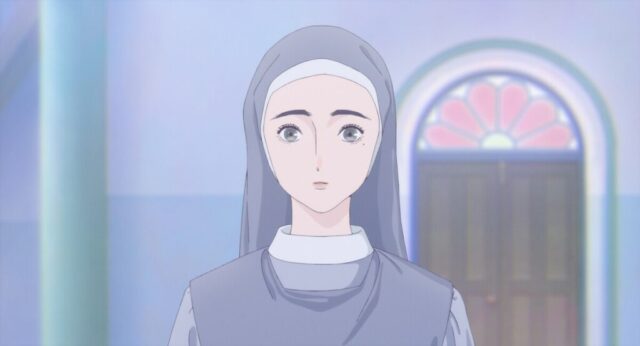
It’s so beautiful. Your use of color speaks so much in this film, and not just color itself, but dance, music and religion. They all meld together, such as in the chapel at the school. Light comes through the window and you can see a pale mint green, a periwinkle or a lilac. In the back you have peach; almost the way the sky looks at sunset sometimes. Everything is soft and lovely and it says so much. But it’s also so delicate and that feeds into the quietness of the nuns, particularly the one, the one sister who’s young, Sister Hiyoku. [Color] also feeds into with the music because music has color. When you hear music, it has color. Certain instruments, certain sounds, make you think of certain colors. You bring all that together in this film. It’s like liquid color that just goes through. Just gorgeous.
Thank you so much. You saw the movie exactly the way I wanted to showcase it. I have no words.
As beautiful as the movie is, the story and the relationship between Totsuko, Kimi and Rui is fantastic. But then you add comedy. You have humor. The name of the band is the White Cat Hall Band. We have Super Nice Ice Cream. Cool Soda. I love the names you came up with for things. So funny and whimsical, which is a nice balance to the serious beauty that we’re seeing. It’s very hard to do that without losing the tone that you’re seeking in the film, but you do that so well. I’m curious how challenging that was for you, to keep that beautiful, ethereal nature and at the same time have fun with some stuff like hiding under the covers at night, thinking nobody’s gonna be able to tell that a person is under a stuffed cat. How did you go about finding that balance?
When I watch movies, I think, “this is not that fun. I’m a little bored, but this is exciting.” I feel different emotions. What I think is important is the first impression that I get from watching the movie. The first impression is really important. That’s what I kept in my mind. But I also create movies for the audience and character building is important, that the characters are lovable to the audience or else the audience won’t want to continue watching what happens to the characters or what they’re going to do. I try to look at the movie or whatever I’m creating in an objective way, but also subjective ways, and then I just mix that in with the importance of first impression of what a movie does, what it gives you.
This movie is created in Japan, but I also wanted audiences around the world with different views from what I feel to see the movie as well. And then I was thinking, how could I create something so that they would accept watching this movie without feeling “a little off.” I think unconsciously, I was able to keep a balance that way. Also, music and sound are very important themes because I think they’re borderless. I think it transcends nationality, etc. So then that was very important. I worked consciously including music and sound so that more people would be able to understand this movie, not just Japanese people, but Western people.
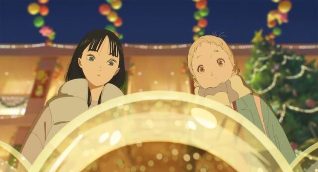
You mentioned sound, sound and music. Number one, the song lyrics, especially the song in your end title credits, speaks so loudly to anybody that hears it or reads the subtitles, so they know what the words are. But you meld that with your sound design. And one of the scenes that really stands out for me, besides the ballet, is the night in the old church on the island with all the candlelight. But then in the morning, Totsuko goes out and we can hear the crunch of the snow. You paid attention to the sound design so it melds perfectly with the dialog and with the music, and nothing overpowers anything else. You treated every element of the film with the same importance, and that’s often difficult to do in a live action film, let alone an animated film. So how did you go about finding that production balance among the different cinematic tools?
I think this really comes down to the understanding of the staff [team] who worked with me. Animation has a lot of information in it. There’s animation, sound, music, time, characters, etc. But I think there’s this requirement to keep it quiet. And then I think having this the staff who has the courage to add or subtract stuff from the different elements in this production. I tend to subtract things from my animation, but then I was lucky to have staff who would say, “Well if you’re gonna subtract that, we’ll add this, and then just make that balance.” They would add these little flavorings. But I think I was very fortunate to just have the staff who worked with me and understood my intentions and how this film should be portrayed. I think it all comes out. Talking about the balance, I think I tend to subtract things, but also leave gaps within what I’m portraying. I tend to want to subtract things because I want to evoke the imagination of the audience, and that’s really important to me.
That’s one of the biggest beauties of animation as it lets your imagination soar. And this film, THE COLORS WITHIN does just that. You see the colors, you see the liquidity of the colors and how they just create this softness, etherealness, which taps into the beauty of nature and God and and what we’ve been given and don’t screw it up. I’m so glad that you have that mindset because imagination does soar in animation and you give us a chance to do that.
I’m actually about to cry.
Thank you so much. I love this movie, and I do love the candlelight scene. Glorious.
Thank you so much.
by debbie elias, exclusive interview 10/19/2024
THE COLORS WITHIN is an Oscar qualifier for the 97th Academy Awards.


