![]()
An in-depth exclusive interview with director PATICK CREADON and design consultant SEAN ADAMS discussing all the colors of Larry Herbert and the Pantone Matching System in the documentary, THE KING OF COLOR.
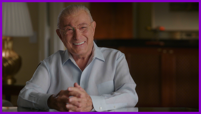
In THE KING OF COLOR, director Patrick Creadon and design consultant Sean Adams explore the life and legacy of Lawrence “Larry” Herbert—the largely unsung visionary behind the Pantone Matching System (PMS)—and, in doing so, illuminate how one man quietly transformed the way the world sees, communicates, and standardizes color across all industries.
Now 96 years old, Herbert grew up in Depression-era Brooklyn at a time when color was anything but precise. Printing was inconsistent, subjective, and often chaotic. From that environment emerged an idea that would ultimately establish a universal language for color—one that reshaped creative industries, manufacturing, branding, and everyday life. Directed by Creadon (Wordplay, Hesburgh), the documentary features an intimate, exclusive interview with Herbert himself, anchoring the film in the voice and perspective of its remarkable subject.
Creadon’s path to Herbert began unexpectedly. As he explains, a mutual friend approached him with what was jokingly described as “a bad idea”—the story of a 95-year-old inventor in Palm Beach, Florida, ready to tell his life story. Before Pantone was even mentioned, Creadon was intrigued by the notion of someone at that stage of life reflecting on a full arc of creation and consequence. When he learned the inventor was Larry Herbert, the connection became personal.
As you’ll hear, Creadon first encountered Pantone in film school in the early 1990s and had long been fascinated by its precision, numbering system, and the idea of color as a kind of high-tech language. Meeting Herbert in person sealed the project almost immediately. Within minutes, Creadon knew he wanted to make the film—drawn equally to Herbert’s sharp humor and vitality, and to the improbable world he created. It was a story, he realized, that could resonate with both professionals who use Pantone daily and audiences who have never heard of it, yet still live in what he describes as a “Pantone world” without realizing it.
To deepen the film’s exploration of color itself, Creadon brought in Sean Adams—an acclaimed designer, author, and educator whose work centers on making color accessible and meaningful to a broad audience. Adams had already written extensively about color and taught courses with the express goal of “bringing color to the masses.” When Creadon reached out, Adams immediately recognized the documentary as, in his words, “an amazing vehicle” for expanding how people perceive and emotionally respond to color—not to turn viewers into printers, but to sharpen their awareness.
The timing proved serendipitous. Adams had recently delivered a talk on mid-century branding that prominently featured Pantone and Herbert, including a case study on Holiday Inn’s success being tied to consistent green and yellow branding—an example that directly underscored Pantone’s cultural and commercial impact. The overlap made the collaboration feel inevitable, a natural extension of Adams’ existing work and interests.
Visually, in addition to archival footage, home movies, photographs, and interviews, THE KING OF COLOR employs a distinctive narrative device: pen-and-ink animation that gradually becomes more saturated as Herbert’s life unfolds. The choice was not merely aesthetic, but deeply rooted in biography and history. Herbert was born into a largely black-and-white world—newspapers, films, and early visual media lacked color entirely. Beginning the animated sequences in stark monochrome reflects the visual reality of his childhood.
As Herbert’s world expands—through his fascination with movies, his discovery of printing machinery in sixth grade, and the explosive growth of color printing in the 1950s—color intensifies within the film, mirroring Herbert’s ever-expanding world. By the time Herbert steps into what Creadon describes as the “wild west” of color printing and invents the Pantone system, the animation has become fully vibrant, mirroring both personal and technological transformation.
As Creadon explains, “We started the pen-and-ink animation in black and white because Larry was literally born into a black-and-white world—newspapers, movies, everything—and then let color slowly seep in as his life, career, and the world of color itself expanded.” He adds, “The animation became our way to visualize the parts of Larry’s story you can’t film—his childhood, imagination, and inner life—and by moving from stark black and white to rich color, it mirrors his journey from a poor kid in Brooklyn to the man who gave the world a language for color.”
The film’s emotional throughline is further reinforced by composer Alex Mansour’s score, which balances whimsy with character-driven intimacy. Mansour joined the project early and immersed himself in Herbert’s personality and family dynamics, crafting recurring musical motifs that quietly unify the film. According to Creadon, “Composer Alex Mansour came on early, got to know Larry alongside us, and somehow found the pulse of both the man and the story—the music feels like Larry’s energy translated into sound.” He adds, “Alex Mansour is a bit of a mad genius—still young, but already a remarkably gifted composer—and his music lifts the documentary to a whole different level.”
The result is a score that mirrors the film’s visual and emotional arcs—playful where color itself feels playful, reflective where legacy and family come into focus.
Legacy, in fact, sits at the heart of THE KING OF COLOR. Herbert has long been concerned with how his life’s work would be remembered. Through this documentary, that concern is put to rest. The film preserves his story not only for his family, but for anyone who has ever chosen a color and assumed it would match.
For Creadon, Herbert’s life embodies a distinctly American narrative. “Larry’s story is the American Dream in full color—a poor kid from Brooklyn who turned a chaotic ‘wild west’ of color printing into a shared language the whole world now quietly relies on,” he says. “Even if you’ve never heard of Pantone, you’ve lived in Larry Herbert’s world; this documentary simply pulls that invisible influence into the light.”
Fittingly, the interview with Creadon and Adams took place the morning after Pantone announced its 2026 Color of the Year, Cloud Dancer. Adams approached the selection analytically, noting, “I’m not crazy about the name—I like the ‘cloud’ part, but I’m not getting ‘dancer.’ What I do love is that it’s a white that asks people to really look at all the different whites out there.” Creadon, meanwhile, saw symbolism in the choice. “When I saw that color, it felt very much like a clean slate,” he said. “And if that’s what next year is about, I’m all for it.”
Like the color it celebrates, THE KING OF COLOR invites viewers to look more closely—at history, at process, and at the unseen systems that quietly shape the visual world we take for granted.
TAKE A LISTEN. . .
by debbie elias, exclusive interview 12/05/2025